[:en]
After a few months of planning and building, we are proud to finally announce the launch of our new website.
The goal was to create a web page that is compliant to modern standards, easy to use and navigate, and has more content.
This is how we were able to achieve this, and our thought process behind it:
Overall Outlook
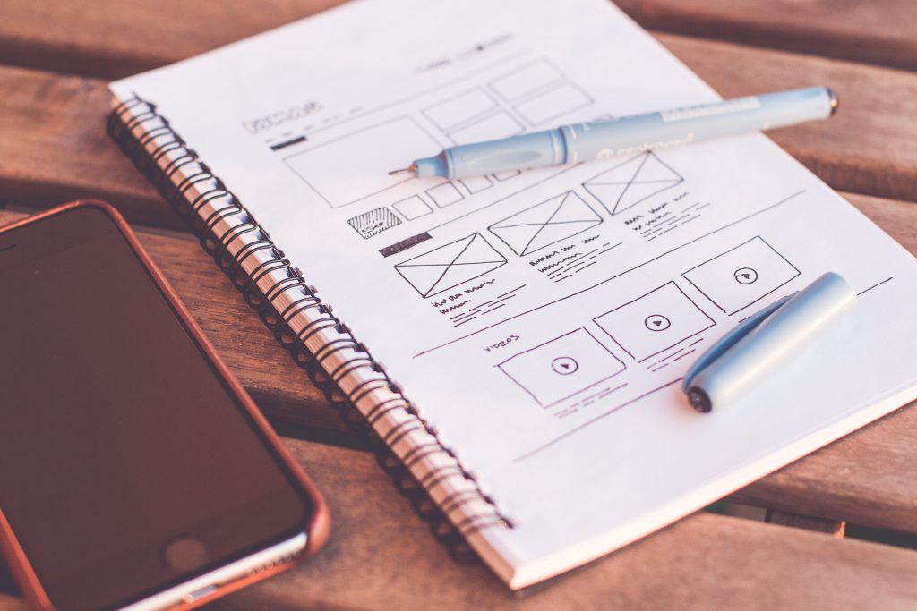
We opted for a clean white and black design, big legible fonts, consistent spacing, and card layouts. The header disappears on down scroll and reappears on up scroll to give you more visibility. User experience means the world to us.
Homepage
The first thing you see in the homepage if you are on a Desktop device is a carousel with a video background. This hopefully allows you to first hand see how the products are being used, and feel closer with our products. On mobile we disabled videos and opted to use images instead, since videos are quite taxing on data.
The remainder of the page follows latest projects, latest blogs, and a newsletter.
Projects, Blogs, and Product Categories
These pages follow a masonry card layout, which we found gives a modern aesthetic. We are trying to have more interaction with our digital products, so we will frequently be updating our project and blog pages in the hopes to increase user interaction.
Search Feature
The search feature is a feature we added because of feedback we received from customers wanting the ability to quickly search our site. By clicking the search icon, you are prompted a search keyword, and directed to a page with the results.
We are not done… yet
Here at LAMA, we are firm believers of constant improvement. We have an agenda of features to add, and on top of that we would love to hear from you. Please contact us with any new features you would like to see, or if you have any feedback.
[:ar]After a few months of planning and building, we are proud to finally announce the launch of our new website.
The goal was to create a web page that is compliant to modern standards, easy to use and navigate, and has more content.
This is how we were able to achieve this, and our thought process behind it:
Overall Outlook
We opted for a clean white and black design, big legible fonts, consistent spacing, and card layouts. The header disappears on down scroll and reappears on up scroll to give you more visibility. User experience means the world to us.
Homepage
The first thing you see in the homepage if you are on a Desktop device is a carousel with a video background. This hopefully allows you to first hand see how the products are being used, and feel closer with our products. On mobile we disabled videos and opted to use images instead, since videos are quite taxing on data.
The remainder of the page follows latest projects, latest blogs, and a newsletter.
Projects, Blogs, and Product Categories
These pages follow a masonry card layout, which we found gives a modern aesthetic. We are trying to have more interaction with our digital products, so we will frequently be updating our project and blog pages in the hopes to increase user interaction.
Search Feature
The search feature is a feature we added because of feedback we received from customers wanting the ability to quickly search our site. By clicking the search icon, you are prompted a search keyword, and directed to a page with the results.
We are not done… yet
Here at LAMA, we are firm believers of constant improvement. We have an agenda of features to add, and on top of that we would love to hear from you. Please contact us with any new features you would like to see, or if you have any feedback.[:]
