
Wholesale pricing, private label, no channel conflict, consistent supply from a manufacturer you can actually call.
Manufacturing since 1963. Now made in Canada. LAMA roofing
Wholesale pricing, private label, no channel conflict, consistent supply from a manufacturer you can actually call.
Find a distributor near you, get install manuals and spec sheets for every product, and submit job-site videos for credit through our rebate program.
From starter tape to torch-applied membranes — everything your customers are asking for.
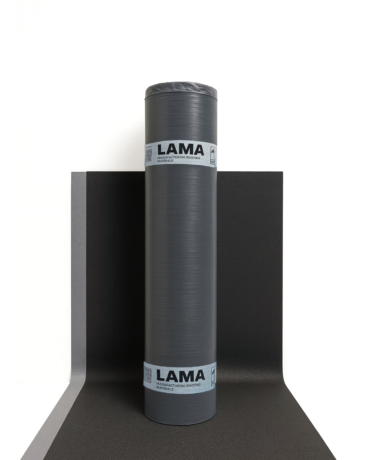
Underlayments for shingle roofing — starter tape, standard, and high-temp options.
ASTM D1970 · CSA A123.22-08 · FBC FL47059
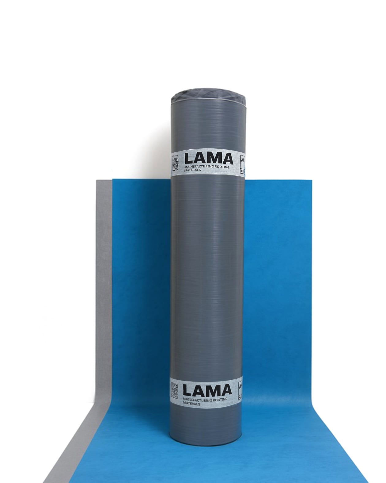
Self-adhered base and cap sheets for commercial low-slope systems.
ASTM D1970 · CSA A123.22-08
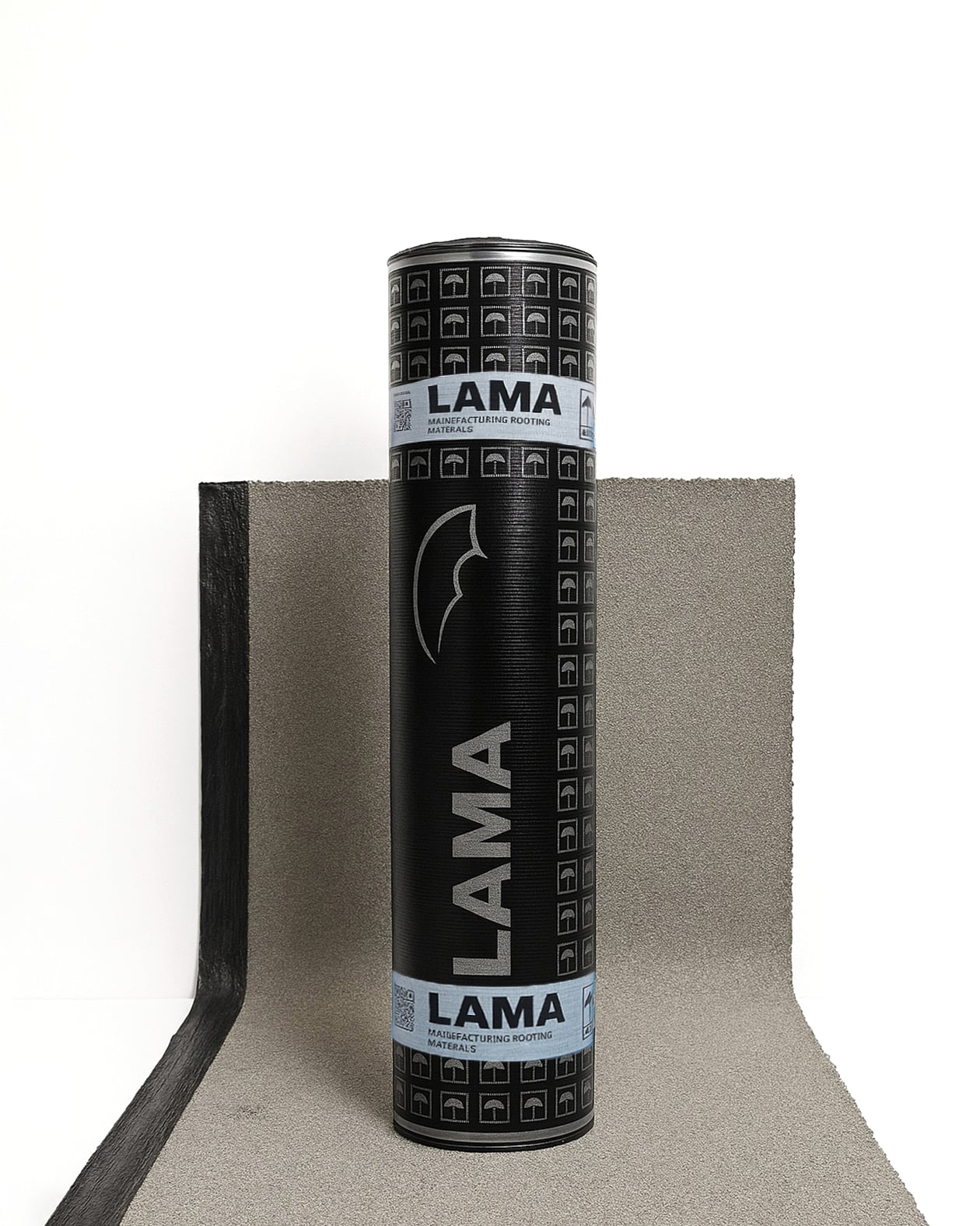
Torch-applied base and cap sheets for multi-ply commercial assemblies.
ASTM D6164G · CSA A123.23-15 Type B Grade 1 · CCMC listing in progress
Every LAMA roll leaves the plant with a batch number tied back to the production run, the raw materials, the lab tests, and the date it shipped — all stored in our internal QMS.
If a question ever comes up — a warranty claim, a customer complaint, a job that went sideways — we can pull the full record on that specific roll. Not next week. Not after we dig through files. The same day you ask.
Learn More About UsNo direct-to-consumer site. Your customers buy from you, not from us.
We invest in what moves rolls off your shelves — contractor rebates, samples, guides, and co-marketing.
3-week standard lead times from Brantford. Buffalo will-call pickup available for US loads. No 90-day ocean container waits.
Tell us what you're working on and we'll send what you need.